Status of Loyalist Baseframes
Moderator: Forum Moderators

Re: Status of Loyalist Baseframes
There are other units for which cape-practicality was ignored. Some awesome, but in-violation-of-the-laws-of-physics headbands. [acronym=Lisar's dress]And so on[/acronym].
-
artisticdude

- Moderator Emeritus
- Posts: 2424
- Joined: December 15th, 2009, 12:37 pm
- Location: Somewhere in the middle of everything
Re: Status of Loyalist Baseframes
Mmm, you have a point. WINR and all. However, even the practicality of the cape aside, I can't help but feel that would be the 'cheap' way out as far as bulking up the unit.beetlenaut wrote:I think the cape improves the look and bulk of the unit enough that we should forget about how practical it is.
"I'm never wrong. One time I thought I was wrong, but I was mistaken."

Re: Status of Loyalist Baseframes


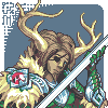
I was basing his size on that of the Lieutenant, which I thought was level three as well. Found out that I was wrong about that (I don't know the Loyalists very well...) and made him as high as the Halberdier. I also adjusted the shading in an attempt to make him look buffer without changing the outline much.artisticdude wrote:1. -I get the general impression that the unit should be, just, BIGGER. Buffer, taller... right now I feel like he's more of a level 2 than a level 3, comparing him to the other revamped loyalist sprites.
I briefly touched the sword and managed to make it look (more?) bent... so yeah... I'll wait to see how Jetrel does it.artisticdude wrote:2. -The sword looks better now, although there are still some issues (which Jetrel will definitely fix in his edit, so I won't bother going into detail about that)
Not realistic, perhaps (although apparently that doesn't matter too much), but IMO it improves his appearance considerably.artisticdude wrote:3. -I'm not sure I like the cape. As cool as the idea is, a cape would hamper a swordsman's ability to wield his weapon.
Made it a little bigger; it's almost the size of the Halberdier's now.artisticdude wrote:4. -The helmet is currently the same size as the swordsman's. Given that this is the level 3, I'd suggest making the helmet slightly larger.
Hmm, definitely. I couldn't think of a lot of places to put it, but I added some.artisticdude wrote:5. -I'd suggest adding more gold bits/trimming. This will not only greatly aid in delivering the visual impression that this is a powerful, high-level unit, but it will also help differentiate the unit from the previous level.
Well... I tried to do this. I'm not sure how well I succeeded.artisticdude wrote:6. -Use more contrast in the outlines of the armor pieces that would be in shadow. Sleepwalker's new sprites are an excellent example of this.
I redrew the shield with a thicker rim, but I haven't detailed it yet because I'm not sure it's the best shape (and, I realise as I'm posting this, it's probably too big).artisticdude wrote:7. -The shield feels rather... flimsy? A thicker rim should do the trick, as well as visually assist the impression that this is a strong warrior capable of dealing out massive amounts of damage.
I moved the helmet and tried to make it not look upwards so much, but then the eye-holes looked strange so I had to redraw them and I don't think I like the new ones...artisticdude wrote:8. -The unit seems to be leaning backwards slightly, although I'm not entirely sure why. Perhaps it's and artifact of the helmet, which appears to be looking upward?
Plenty of the details still need refining, but how is the general shape looking?
- Attachments
-
- revision 8.png (3.12 KiB) Viewed 16131 times
-
- revision 8 without cape.png (3.1 KiB) Viewed 16131 times
-
artisticdude
- Moderator Emeritus
- Posts: 2424
- Joined: December 15th, 2009, 12:37 pm
- Location: Somewhere in the middle of everything
Re: Status of Loyalist Baseframes
Hm, the new version is definitely an improvement, nice work on that. I still feel he's a mite on the small side of the scale, though. I believe it's due to the more realistic pauldrons and the slightly narrow hip area. On that note, I quite like what you've done with the shape of the hip plates.
Here's an edit that should help convey my meaning a little better. Obviously it's rough, and unshaded in places, but it's more for understanding proportions than an attempt at a finished product. It's the exact same height as your most recent version, just a bit buffer.
Here's an edit that should help convey my meaning a little better. Obviously it's rough, and unshaded in places, but it's more for understanding proportions than an attempt at a finished product. It's the exact same height as your most recent version, just a bit buffer.
- Attachments
-
- cfn.gif (1.91 KiB) Viewed 16018 times
-
- cfn1.png (5.93 KiB) Viewed 16018 times
"I'm never wrong. One time I thought I was wrong, but I was mistaken."
-
thespaceinvader

- Retired Art Director
- Posts: 8414
- Joined: August 25th, 2007, 10:12 am
- Location: Oxford, UK
- Contact:
Re: Status of Loyalist Baseframes
There's definitely something in that comment, artisticdude. I've been looking at this guy,m and thinking 'well, he looks great, but he doesn't look level 3'. Buffing him up a bit more and blinging him up a bit more definitely helps.
http://thespaceinvader.co.uk | http://thespaceinvader.deviantart.com
Back to work. Current projects: Catching up on commits. Picking Meridia back up. Sprite animations, many and varied.
Back to work. Current projects: Catching up on commits. Picking Meridia back up. Sprite animations, many and varied.
Re: Status of Loyalist Baseframes
Hmm, yeah, I see what you mean. So, following your example:


Still can't manage eyes that I'm happy with, nor a pommel at the same angle as the blade, and I think the right pauldron looks weird, too. I also realised how inconsistent my lightsources are, but I haven't corrected it because I'm not actually sure where Wesnoth's lightsource is supposed to be - the other units don't seem to be extremely clear about it either...
The version without the cape definitely looks top-heavy, but IMO larger feet - although they help - make him look rather cartoonish.
- Attachments
-
- revision 9 without cape.png (3.26 KiB) Viewed 15922 times
-
- revision 9.png (3.27 KiB) Viewed 15922 times
-
artisticdude
- Moderator Emeritus
- Posts: 2424
- Joined: December 15th, 2009, 12:37 pm
- Location: Somewhere in the middle of everything
Re: Status of Loyalist Baseframes
Hm, you know, it's very odd, but I can't find any official specification on this.enchilado wrote:I also realised how inconsistent my lightsources are, but I haven't corrected it because I'm not actually sure where Wesnoth's lightsource is supposed to be - the other units don't seem to be extremely clear about it either...
This really should be added to the wiki or something.
"I'm never wrong. One time I thought I was wrong, but I was mistaken."
Re: Status of Loyalist Baseframes
I liked the Royal Guard's old shield >.>
- Attachments
-
- new_royalguard.PNG (10.35 KiB) Viewed 15871 times
-
Blarumyrran
- Art Contributor
- Posts: 1700
- Joined: December 7th, 2006, 8:08 pm
-
thespaceinvader
- Retired Art Director
- Posts: 8414
- Joined: August 25th, 2007, 10:12 am
- Location: Oxford, UK
- Contact:
Re: Status of Loyalist Baseframes
Zero: I have to disagree. The old shield isn't iconic, you're viewing it as a sacred cow. The new shield looks much better, and much more natural, and it would be a tremendous shame to lose it. Plus, the old one looks really flat and flyswatted, and it's difficult to envision him holding it as anything other than a pot lid, which is not only unrealistic but also looks silly.
New shield.
Plus, he's not royalty, he's a royal GUARD Both you and SynErr have a point about one thing though - the plume needs to be bigger and more impressive.
Also, could you please post some side-by-side comparisons with the Pikeman, Halberdier and Swordsman (the new ones) as it's difficult to see where the fit into the tree in isolation.
New shield.
Plus, he's not royalty, he's a royal GUARD
Also, could you please post some side-by-side comparisons with the Pikeman, Halberdier and Swordsman (the new ones) as it's difficult to see where the fit into the tree in isolation.
http://thespaceinvader.co.uk | http://thespaceinvader.deviantart.com
Back to work. Current projects: Catching up on commits. Picking Meridia back up. Sprite animations, many and varied.
Back to work. Current projects: Catching up on commits. Picking Meridia back up. Sprite animations, many and varied.

Re: Status of Loyalist Baseframes
About that plume, i was under the impression that there was an agreement plumes are supposed to only be for loyalist leaders. Did a little search to confirm and found this comment by Jetrel:
Would it be too cluttered if the dinkier plume came out from under the traditional spike?
Now mind, that was WAY back in 2006 so his stance on it could very well have changed since then and he hasn't mentioned it himself here. I figured this new royal guard had gotten a pass because the plume was dinky enough.Jetrel wrote:For loyalists, the plume indicates leadership. Feathers don't signify this, but the straight-out military horsehair(?) plume does.
Would it be too cluttered if the dinkier plume came out from under the traditional spike?
Last edited by Neoskel on September 4th, 2011, 4:09 am, edited 1 time in total.
-
artisticdude
- Moderator Emeritus
- Posts: 2424
- Joined: December 15th, 2009, 12:37 pm
- Location: Somewhere in the middle of everything
Re: Status of Loyalist Baseframes
Hm. While I definitely would argue against keeping the old shield, I do think it would be a good idea to have the Scepter of Fire insignia on the sprite somewhere. Unfortunately, I don't see where it would work without become unreadable or clunky, unless perhaps he held his sword in his left hand and his shield in his right (that way we could put the insignia on his shield, since the outer surface would be facing the viewer). Again though, I'm not entirely sure it would be worth it, in the end. Zero's new sword & other edits are definite improvements, though.
And I'd just like to reiterate my earlier statement that I'm not a big fan of giving him a cape/cloak. Although if we're not going to TC the inside of the shield (assuming we keep the shield in the sprite's left hand), it might be necessary in order to have a decent amount of TC on him.
One more thing: I'd suggest making the shield handle/strap slightly oversized so as to be readable, especially if it's going to be TC'ed. At first glance I thought the strap/handle on Blarumyrran's edit strap was part of the unit's armor.
And I'd just like to reiterate my earlier statement that I'm not a big fan of giving him a cape/cloak.
One more thing: I'd suggest making the shield handle/strap slightly oversized so as to be readable, especially if it's going to be TC'ed. At first glance I thought the strap/handle on Blarumyrran's edit strap was part of the unit's armor.
"I'm never wrong. One time I thought I was wrong, but I was mistaken."
Re: Status of Loyalist Baseframes
I quite like Blarumyrran's version of the skirt. It looks a lot fancier.
Hmm... IMO, Zero's sword is a little big, but it's certainly drawn better than mine. I like what he did with the top of the chestplate and the chainy part of the skirt, too.
As for the shield, I thought the defense animation could show the front of it with TC and the Sceptre of Fire. And I still haven't figured out how to draw a strap that looks separate from the armour without covering up his whole arm.
- Attachments
-
- revision 10 + comparison.png (11.87 KiB) Viewed 15754 times
-
- revision 10 + comparison without cape.png (11.72 KiB) Viewed 15754 times
-
- revision 10 + comparison with some of Zero's edits.png (11.97 KiB) Viewed 15754 times

Re: Status of Loyalist Baseframes
I started out trying to tweak the helmet (couldn't shake the image of a silver ninja turtle head) but ended up changing a lot more. Still some stuff I wanted to work up a bit, but I really have to get to bed and it may be a few days before I can get back to it, so critique, edit, scavenge, etc. away.
- Attachments
-
- unit.PNG (4.4 KiB) Viewed 15528 times
-
beetlenaut

- Developer
- Posts: 2828
- Joined: December 8th, 2007, 3:21 am
- Location: Washington State
- Contact:
Re: Status of Loyalist Baseframes
That looks better. The helmet is probably fine, but seems to be missing something; seams, maybe. Also, the rim of the shield matches up with the edging on the cape. I read it wrong at first, and it's still distracting, so I would nudge the edge of the cape down a pixel or two. Overall, it looks more like a finished sprite than a work in progress now.
Campaigns: Dead Water,
The Founding of Borstep,
Secrets of the Ancients,
and WML Guide
The Founding of Borstep,
Secrets of the Ancients,
and WML Guide