Aragwaith Unit Images 2.0
Moderator: Forum Moderators
Forum rules
Before posting critique in this forum, you must read the following thread:
Before posting critique in this forum, you must read the following thread:
-
wayfarer
- Art Contributor
- Posts: 933
- Joined: June 16th, 2005, 7:07 pm
- Location: Following the Steps of Goethe
- Contact:
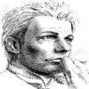
For test purposes I have thrown my original and Neorice's edit together and I want to know what do you think about it.
I bet that dibblethewrecker will have problems viewing them again.
I bet that dibblethewrecker will have problems viewing them again.
- Attachments
-
- evolution.png (6.73 KiB) Viewed 4528 times
This girl, this boy, They were part of the land. What happens to the places we used to tend?
She's a hard one to trust, And he's a roving ghost. Will you come back, will you come back, Or leave me alone?
-Ghost Fields
She's a hard one to trust, And he's a roving ghost. Will you come back, will you come back, Or leave me alone?
-Ghost Fields
I'd say give the right one the spear of the middle one and use the result.
WesCamp-i18n - Translations for User Campaigns:
http://www.wesnoth.org/wiki/WesCamp
Translators for all languages required: contact me. No geek skills required!
http://www.wesnoth.org/wiki/WesCamp
Translators for all languages required: contact me. No geek skills required!
i like the combined neo and wayfarer style
I am Oreb, Lord of the Darthien
Give your comments to the World of Orbivm
Give your comments to the World of Orbivm

I think the face on Wayfarer's is not defined enough. I like the blend the best other than that.
For I am Turin Turambar - Master of Doom, by doom mastered. On permanent Wesbreak. Will not respond to private messages. Sorry!
And I hate stupid people.
The World of Orbivm
And I hate stupid people.
The World of Orbivm
The problem with Wayfarer's style is that it's cramped when you try to put it into Wesnoth scale. If units were larger, then they would much much better than the wesnothian style - but on smaller scales, it's better to go with more clear and cartoonish looks.
EDIT:
I like the combination, though. It's pushing the borders forward
EDIT:
I like the combination, though. It's pushing the borders forward

-
Darth Fool
- Retired Developer
- Posts: 2633
- Joined: March 22nd, 2004, 11:22 pm
- Location: An Earl's Roadstead
one on the right. The middle one's hair is just wrong.
"you can already do that with WML"
Fight Creeeping Biggerism!
http://www.wesnoth.org/forum/viewtopic. ... 760#131760
http://www.wesnoth.org/forum/viewtopic. ... 1358#11358
-
Woodwizzle
- Posts: 719
- Joined: December 9th, 2003, 9:31 pm
- Contact:
-
WanderingPaladin
- Posts: 36
- Joined: November 3rd, 2005, 9:18 pm
- Location: Rochester, NY
That sums it up nicelyNaeddyr wrote:The problem with Wayfarer's style is that it's cramped when you try to put it into Wesnoth scale. If units were larger, then they would much much better than the wesnothian style - but on smaller scales, it's better to go with more clear and cartoonish looks.
EDIT:
I like the combination, though. It's pushing the borders forward
-
Kestenvarn

- Inactive Developer
- Posts: 1307
- Joined: August 19th, 2005, 7:30 pm
- Contact:

Wayfarer being the artist who drew these, and an artist who is fairly competent, I'll trust to choose whatever graphical style he likes.
There are advantages and disadvantages to different graphical styles. Dark edges can make something look more defined, yet at the same time, partition an object into large sections. For an example of the bad things it can result in, the hair on the most recent image, in neo's edit, tends to look somewhat like a cloth keffiyeh - effectively making it not look like hair at all.
It is true that Wayfarer shows very little of the eyes in his images. Though I don't suggest drawing them with the procedural "two white pixels next to two black pixels", I do suggest making somewhat clear and visible eyes, one way or another. That's about the only thing that I disagree with about his style of drawing faces - and frankly, in many cases, suggesting the eyes instead of explicitly drawing them comes out perfectly fine. To comply with wesnoth's graphical style, we do need to be careful to at least suggest eyes, though we don't need to draw them explicitly.
I like the newer better. However, like some rule said, the pose hs to change when a unit levels up, unless a major detail is changed (like, when leveling up, the unit loses it's shield).
me: Welcome to the real world. If everyone says your art and opinions suck, it's because they DO suck. Even if you're too damned proud/stupid/both to realize it.
danny_california: yep keep telling fairy tales.
danny_california: yep keep telling fairy tales.